Overview
On the Strategize page, under the "Total Patient Cost" tab you can compare physicians of your choice by the average Medicare spend for their patients in the six or twelve months following treatment. The total patient cost metrics show downstream affects of cost of care provided by all providers during the follow up period.
 In this article
This article shows the features of the page as it walks you through the steps you would follow to setup your selected physicians and then perform evaluation and comparison of the resultant chart and table of metrics.
- Page Overview
- Location
- Setting up your Physicians for Comparison
- Comparison Chart
- Table of Metrics
- Reporting Period and Follow up period
Page Overview
The following image includes the basics of the Total Patient Cost tab on the Strategize page. The different features of the page are described below.
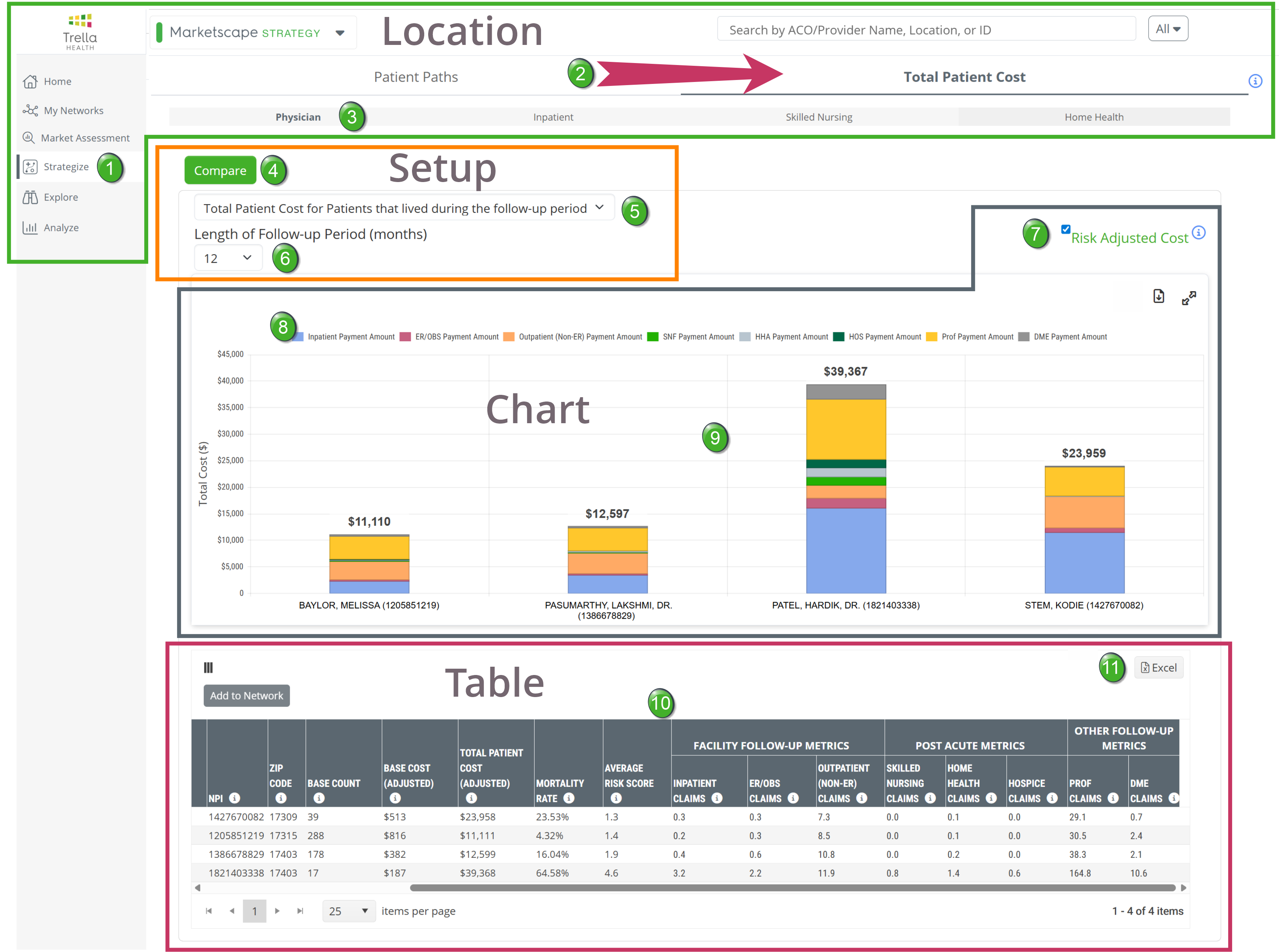
Location
|
|
 |
![]() Click on the "Total Patient Cost" tab. (The other tab, "Patient Paths," is the default tab when the Strategize page is opened.)
Click on the "Total Patient Cost" tab. (The other tab, "Patient Paths," is the default tab when the Strategize page is opened.)
![]() Physician tab - The Total Patient Cost report page can be viewed for physicians, hospitals (inpatient), skilled nursing facilities, and home health agencies. The four options are displayed in a shaded bar. Click on the "Physician" link to view the report for physicians.
Physician tab - The Total Patient Cost report page can be viewed for physicians, hospitals (inpatient), skilled nursing facilities, and home health agencies. The four options are displayed in a shaded bar. Click on the "Physician" link to view the report for physicians.
![]() When the page is first opened, nothing will be shown on the page. The next step is to select the physicians for whom you want to display metrics in the chart and table on the page.
When the page is first opened, nothing will be shown on the page. The next step is to select the physicians for whom you want to display metrics in the chart and table on the page.
 Data Note
Clicking the i in the circle ![]() at the very top right of the page will display the following message: "Note: Physician patient populations in Total Patient Cost are restricted to specific E&M billing codes. If a given physician does not provide those services, they will not appear in the Total Patient Cost report. Please see our Help Center article for additional detail." The article referenced is, What are the CPT codes used in Physician Total Patient Cost?
at the very top right of the page will display the following message: "Note: Physician patient populations in Total Patient Cost are restricted to specific E&M billing codes. If a given physician does not provide those services, they will not appear in the Total Patient Cost report. Please see our Help Center article for additional detail." The article referenced is, What are the CPT codes used in Physician Total Patient Cost?
The goal of limiting the data to align with specific CPT codes is to identify physicians truly taking care of patients and not including physicians seeing a patient one time only.
Setting up your Physicians for Comparison
 Compare
The Select Physicians dialog box will open. In short, you will be able to select which physicians you want to compare. |
 |
 Select Physicians
The Select Physicians dialog box is shown below.
 Details
- The image above shows that three physicians have already been selected.
- To select additional physicians, you can use the Search by Location, Name, or NPI field
![]() The more specific you are, the better the results. 2 Examples:
The more specific you are, the better the results. 2 Examples:
Example 1
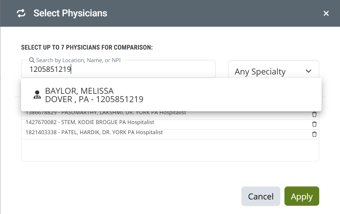
In the first example, we have entered the NPI for a specific physician.
- Click on the name in the list that appears. The name of the selected physician will then appear in the list of Selected Physicians.
- Click on the "Apply" button to apply the selected physicians to the chart and table on the page.
Example 2
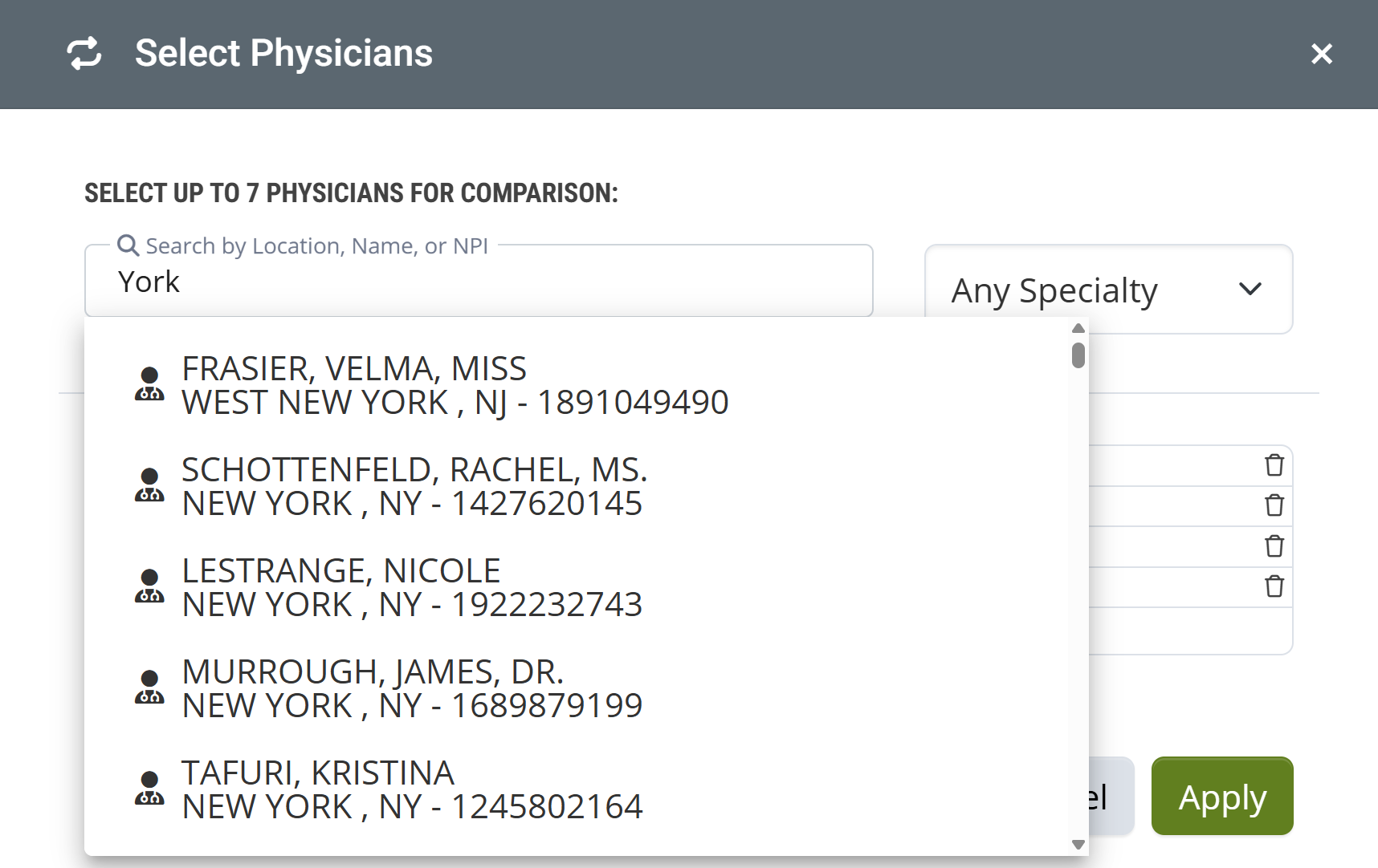
In this example, we searched for "York" to find physicians in York, PA. The top returns in the search are from New York. If we were to scroll down about half way, several physicians from York, PA show up.
Your best option is to look up the NPIs or names of specific physicians before you start.
![]() You can choose up to 7 physicians to be shown in the chart and table on the page.
You can choose up to 7 physicians to be shown in the chart and table on the page.
 Filter Options
There are two filters that you can set that will change the results in the chart and table on the page.
Patients who lived vs patients who died
The top filter allows you to choose whether you want to focus on patient costs specifically for patients who died during the follow up period or not. *****
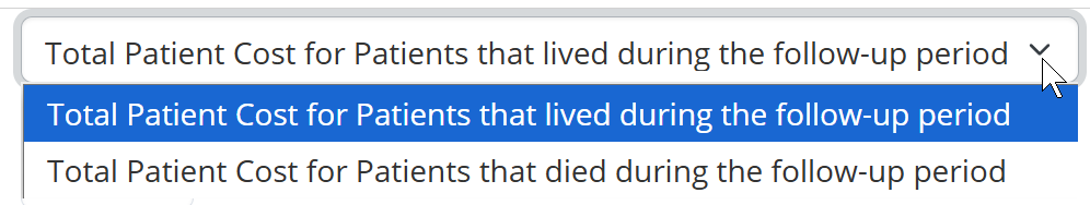
- Choose the option that aligns with the patient population you want to examine in the chart and table on the page.
Follow up Period length
You can choose whether the metrics in the chart and table on the page reflect a six month or a twelve month follow up period.
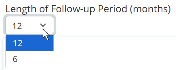
- Choose "12" for a twelve month follow up period
- Choose "6" for a six month follow up period
![]() For more information, see Reporting Period and Follow up period.
For more information, see Reporting Period and Follow up period.
Comparison Chart
The following image shows the Total Patient Cost chart. The chart shows the four physicians we selected using the Compare tool above.
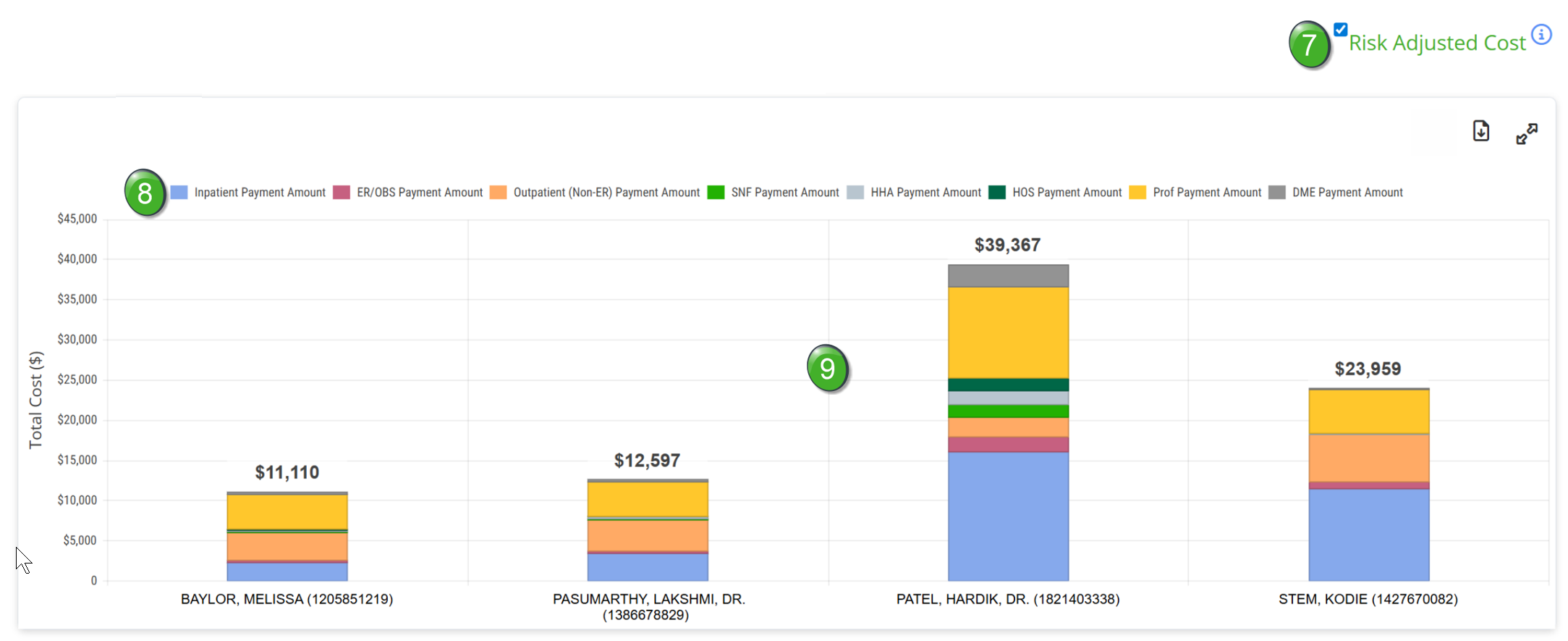
 Risk Adjusted Cost
The blue and white check mark is a toggle that allows you to turn risk adjustment on or off for the metrics on the page. Putting the check mark on will adjust the metrics on the page to present a risk-adjusted version of the table and chart. This is the default setting.
Since higher patient risk scores indicate a population with more severe medical conditions, adjusting the cost based on population severity allows for a more comparable cost analysis between physicians.
The HCC risk scores are used to adjust cost relative to other NPIs of the same provider type. Adjusted costs allow for better comparison across NPIs with different risk scores because it accounts for the increased cost of patients with chronic conditions. For example, NPIs with a higher than average risk score will have a reduced adjusted cost since they have sicker patients, and NPIs with lower risk scores have increased adjusted cost.
![]() The i in the circle
The i in the circle ![]() provides a link to the following article - Risk Scores and HCC. Far more details on Risk Scores and HCC.
provides a link to the following article - Risk Scores and HCC. Far more details on Risk Scores and HCC.
 Interactive Legend

The chart legend shows the alignment of the colors in the bar graphs in the chart to the provider claim type. Each legend color is a toggle. If you click on the colored box to the left of any provider type, that selected provider type will no longer be shown in the chart. Click again to add that provider type back.
 Chart Details
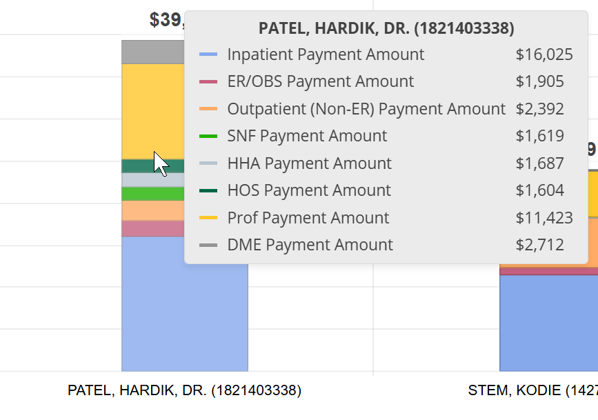
In short, the chart shows comparison average costs for patients treated by the selected physicians during the selected follow up period. The chart provides a visual comparison, but you can also hover over the data bar in the chart for any displayed physician and a pop-up window will open as shown below.
Things to Look for!
- At the top of each column is a total average cost for each selected physician calculated from costs during the follow up period. This provides an instant appraisal of comparative costs for the selected physicians.
- Each color in the bar graph represents a specific provider claim type. You can easily see which provider types contributed the most to each average total cost.
Table of Metrics
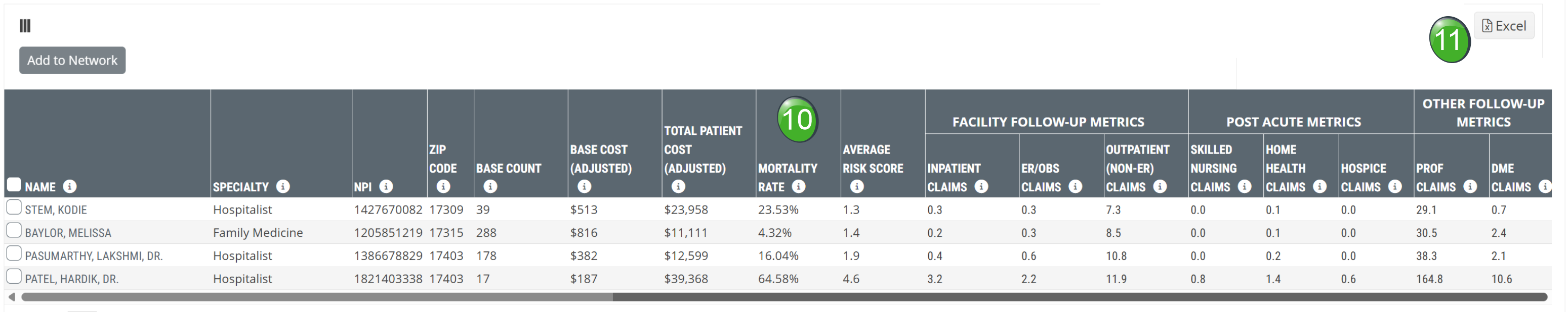
 Total Patient Costs table
The table at the bottom of the page shows other useful metrics to help you evaluate your selected physicians. Metric definitions are below.
 Excel Export
Click on the Excel icon ![]() to export the data in the table to a Excel spreadsheet.
to export the data in the table to a Excel spreadsheet.
Understanding the Metrics
Metric Name |
Description |
|
|
Name/Specialty/NPI/ ZIP Code |
The information in these four columns are shown for the selected physicians as they are listed in the CMS Provider Data NPI file. | |
| Base Count | The count of patients the follow-up metrics are based on. Includes patients seen by the physician during the 12 months prior to the most recent 12 months, ending at the end of the latest data release. | |
| Base Cost (Adjusted) |
This metric is the average Medicare reimbursement, in dollars, for the selected physician during the follow-up period. (Adjusted) indicates that you have selected to turn on the Risk Adjusted Cost option. |
|
| Total Patient Cost (Adjusted) |
The average total Medicare spend for a given patient over the selected follow-up period. (Adjusted) indicates that you have selected to turn on the Risk Adjusted Cost option. |
|
| Mortality Rate |
The percentage of patients who were initially included in the base count that died during the selected follow-up period.
|
|
| Average Risk Score | This is the average Hierarchical Condition Category (HCC) Risk Score for the listed NPI. | |
| Facility Follow up metrics | Inpatient Claims | The average number of inpatient claims during the selected follow-up period (Includes LTACH & IRF). |
| ER/OBS Claims | The average count of emergency room and observation claims beginning during the selected follow-up period. | |
| Outpatient (Non-ER) Claims | The average number of non-ER/Obs outpatient claims beginning during the selected follow-up period. | |
| Post Acute Metrics | Skilled Nursing Claims |
The average number of skilled nursing claims beginning during the selected follow-up period. |
| Home Health Claims |
The average number of home health claims beginning during the selected follow-up period. |
|
| Hospice Claims | The average number of hospice claims beginning during the selected follow-up period. | |
|
Other Follow Up Metrics
|
Prof Claims |
The average number of professional claims beginning during the selected follow-up period |
| DME Claims | The average number of durable medical equipment claims beginning during the selected follow-up period. | |
Reporting Period and Follow up period
In order to be able to calculate all additional events subsequent to the physician's claims, we need to go back into the year prior to the most recent year of data. This allows us to collect costs from claims for the follow up period that can be up to 12 months. As you can see from the image below, the initial claims that trigger inclusion in the Total Patient Cost metrics are taken from the first year (on the left) so that the follow up period can extend into the second year.
We use the same first year reporting period for a six month follow up period so that we are looking at the same initial patient population. Only the length of the reporting period changes.
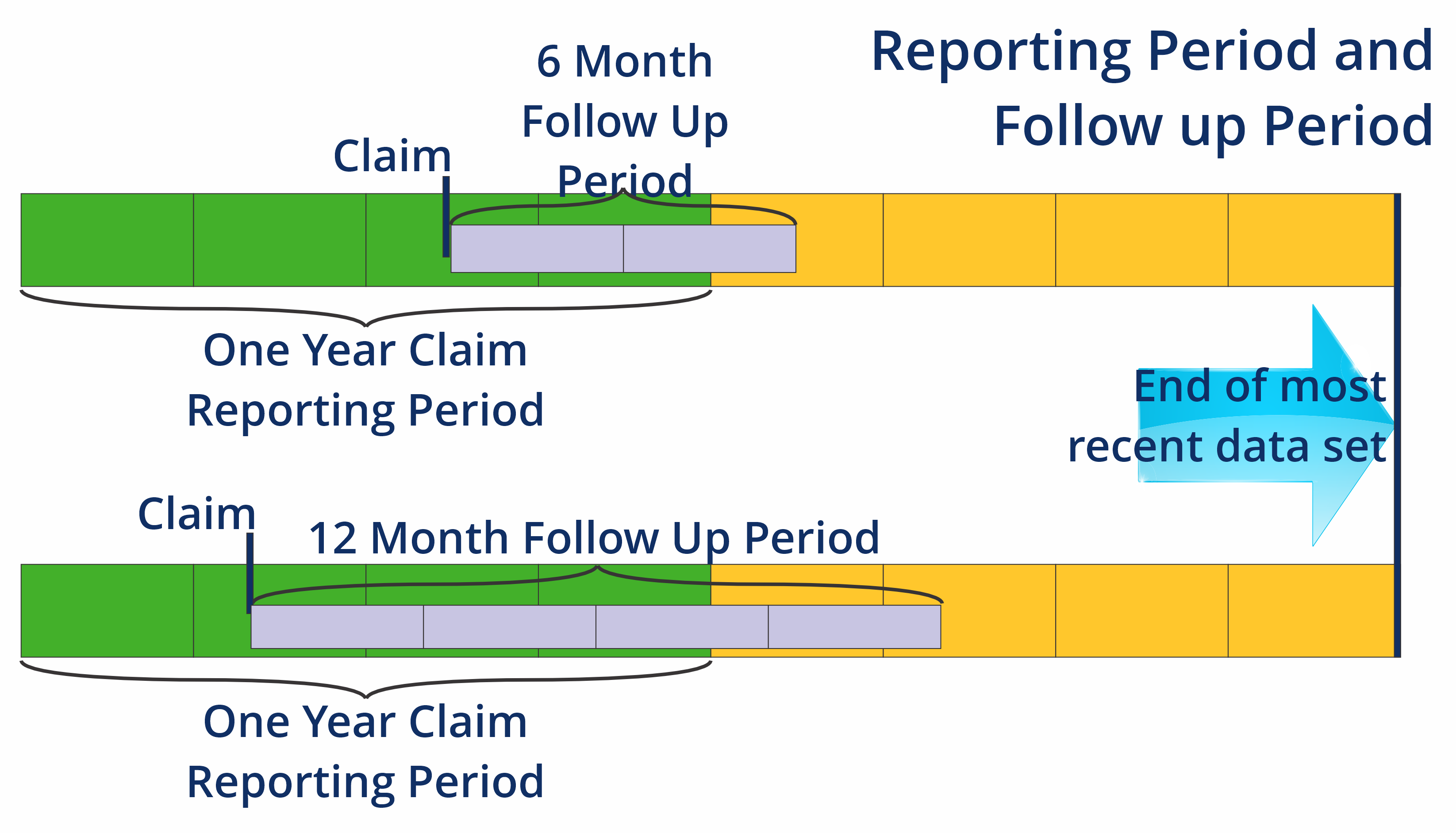
![]() Keep in mind that these are not calendar years but the two years prior to the end of the most recent quarter of data available.
Keep in mind that these are not calendar years but the two years prior to the end of the most recent quarter of data available.